I spoke with Jeremy Macfarlane, production designer of Hotline Bling, to get the inside scoop on how the strikingly graphic video’s lighting effects were achieved.
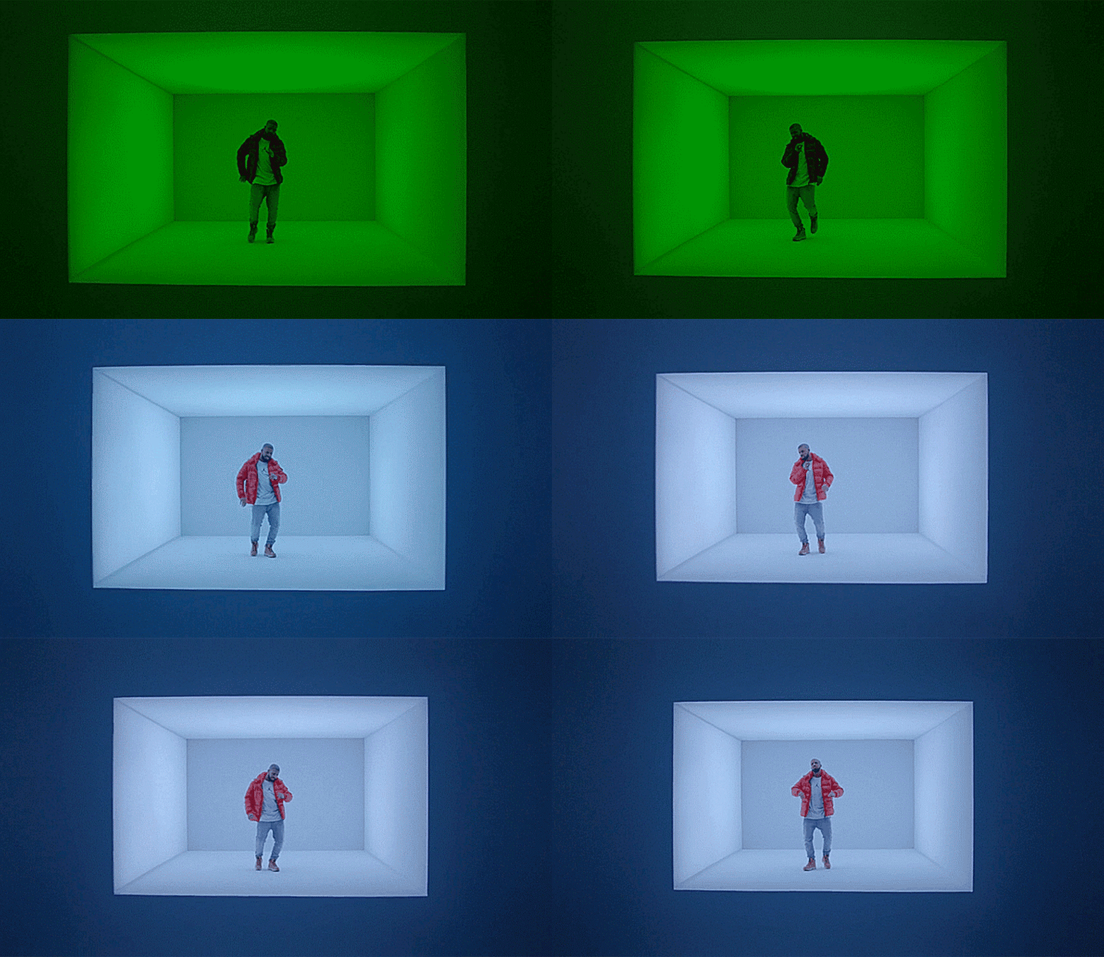
Last week, Canadians headed to the polls to elect a new Prime Minister. At the end of the night, one man emerged a clear winner: singer-songwriter Drake. After dropping a striking new video for his catchy hit Hotline Bling, he dominated social media, eclipsing even the election results. The internet wasted no time in generating memes based on the video’s stunning visuals, which seem to pay homage the colourful light-based art installations of James Turrell:
The video, though undeniably eye-catching, is also deceptively simple in its appearance, relying on less than half a dozen minimalist set pieces. Director Julien Christian Lutz (better known as Director X) has a history of creating videos with strong, geometric sets where lighting plays a key role. But although the sets appear spartan, an enormous amount of effort and ingenuity went into ensuring that the mechanics remain unseen in the final result.
“The look that X wanted to achieve could only be achieved if the architecture itself was emitting light,” says production designer Jeremy Macfarlane. “It’s based on a very tight relationship between light and opacity of materials. That was really the concept here – to try to flood the artist with light. And how are we going to do that, and do it from within an architectural source, as opposed to just bouncing light off an architectural source, which is very different.”
For most of the walls, which emit a soft glow in ever-changing hues, LED backlighting was the obvious choice. “We wanted colour flooding,” says Macfarlane, explaining the choice of Chroma-Q’s Color Force high-powered banks of full-spectrum LEDs. “We worked very closely with Adam Marsden, the director of photography; Adam was the lighting designer, and he determined the outcome of the video in that regard.” Because the cameras were exposing at higher-than-normal frame rates, in order to allow for a fluid recreation of movement even when playback is slowed down, the lights had to be even brighter than usual. This was compounded by the fact that the LEDs were not lighting the scene directly, but were embedded inside the set’s walls.
“When you’re dealing with light,” says Macfarlane, “the biggest challenge is the proximity of the source – not only to the subject, but also to whatever you’re passing light through.” In this case, that light was passing through white Spandex – roughly 1,125 square metres of it – ordered from a theatre supply company. According to art director Andrea Toth, the team experimented with several types of membranes, including the plastic tarps used to cover boats, before discovering that Spandex could offer a wrinkle-free surface that evenly scatters light when stretched over a wall-sized frame. These massive frames were held up solely by an internal structure of steel trusses; with the wrong lighting, the supports would cast shadows onto the visible surface.
To solve this problem, the team used two or even three layers of Spandex, separated by 15 to 30 centimetres to allow for full diffusion. The banks of LEDs were positioned still further behind the walls to avoid the appearance of individual points of light: “They were at least 30 centimetres back,” says Macfarlane. “We could place them up to two metres away, depending on the geometry that we were working with.”
Experimentation with the orientation of the lights and Spandex membranes had to take place during the construction of the sets – a less than ideal situation. “We had incredibly compressed timelines, and very compressed space,” explains Macfarlane. Amazingly, the sets were constructed in less than five days – a miracle accomplished with the help of set construction firm Performance Solutions.
That includes the floating staircase, the only set piece not illuminated from within. “The staircase was a massive undertaking,” Macfarlane says. “It’s all welded box steel, and it had to be safe and completely straight. And, of course, support its weight and triangulate that weight across a great distance.” In fact, the team was not able to fit commercially available trusses within the planned dimensions of the stair, so they used custom-welded trusses instead. On the top end, the trusses were supported by two pieces of steel 7.3 metres above the stage, gripped to a nine-metre-square ceiling grid hidden by a drop ceiling outlined by more LEDs. There were no hidden supports digitally removed in post-production: “That and the bottom of the stairs were the only points of contact,” Macfarlane says. The underside of the staircase was illuminated by unseen LEDs, which cast a reflected glow on the stage to eliminate the stairs’ shadow, and could be changed to different hues to outline the contours for a “vignette” effect.
All these set pieces were built on castors to allow them share the same stage. “We wanted a seamless, flooded look, but ran out of physical space to create the effect of an infinite horizon,” Macfarlane says. “We were literally shooting something on one set piece, and 20 metres away, guys were pulling out the staircase with forklifts. And it weighed thousands of pounds.” Such portability, while it added to construction costs, reduced shoot times and allowed the team to achieve all the effects they wanted; the different pieces could be moved into position, typically by two people, or broken down into components that could appear in other shots.
Hotline Bling is a thoroughly Torontonian product: besides Drake, Director X and Macfarlane are also locals, and the video was produced by Toronto creative collective S8 and shot at Toronto’s Revival studios. And although it was a massive undertaking, Macfarlane says, “It was so much fun to do. Everybody was really lovely. The crew – everybody. Drake included.”


