In this exclusive interview, architect Sou Fujimoto talks about how to merge fashion and architecture, using light as a material to build in space, and working at the threshold of perception.
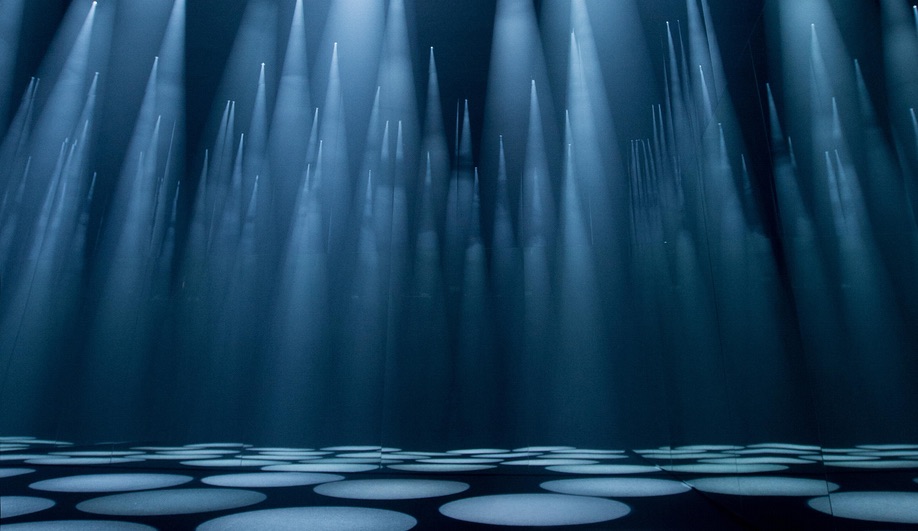
The September 2016 issue of Azure features Sou Fujimoto’s Forest of Light installation, produced for clothing brand COS during this year’s Milan Design Week. Below is an extended version of the interview, in which the renowned Japanese architect talks in greater detail about the development behind the project – a forest of spotlights that fade slowly in and out, seemingly stretching forever.
How did the Forest of Light project begin?
When I did the Serpentine Pavilion in 2013, COS supported us as one of the sponsors. I knew they had been doing similar collaborations for Milan Design Week with different architects, designers, or artists, so I was very happy when I heard from them. The brief itself was quite open. No strong requirements. Of course, it wasn’t a question of just showing their clothes. They wanted me to make a representation of the thinking or philosophy behind their fashions. It’s more like an architect’s re-translation of their philosophy into the space.
This installation, then, is an interpretation of the brand through your eyes?
Yes. Both COS’s and my own architectural thinking share the aesthetics of the timeless, simple basics. In simplicity, there’s elegance. That duality of simplicity and complexity is very similar to my architectural thinking, too. My architecture’s not just a simple, minimal thing, but always relates to the richness and complexity of our life. So in that sense, I felt like, wow. We really share something.
Of course, fashion and architecture are quite different. Almost opposites. Maybe the only point they share is that both of them – fashion and architecture – relate to our daily life, our body and behaviour. That’s quite an interesting point, though, because those things are really essential to both disciplines, even though afterwards, their final products are completely different.
Based on that really basic understanding of the COS philosophy, and the differences and disparities between fashion and architecture, I tried to create something between the two. Not architecture, not fashion – something that’s independent from both of them, but still creates a nice link. The idea of using light as the material came out of many studies and discussions; I didn’t want to bring architectural materials to the space, because it gets too close to our field. And of course, fabric or something like that is too close to their field. Finally we thought, building without any physical materials could be nice.
You’ve talked about a concept you developed for the Middle East by saying “The structure is created by the light” – a physical structure where light would define the space. This project seems almost like an extrapolation. Is building using light something you’ve been thinking about, or wanting to try, for a long time?
Yeah, in a sense, light itself is like the extreme, ideal material for architects. For normal architecture and design, we have to make something physical. But parallel with making the physical frame or structure, we always think about how light interacts with the space, how people’s behaviours interact with the space. And in this case, we thought we could use the idea of the spotlight to create spaces.
Then we started thinking about how to make it. Of course, the idea of spotlights relates to fashion. And it also relates to the location, which is a former cinema. Because there’s layered meanings, I thought the idea to use light as a material could be very suitable for this project.
The theme of the forest – that comes more from my personal background and my personal thinking about architecture. For me, the forest is an interactive space. And if you use the light as a material, then you’re really getting interactive.
What were some of the technical challenges encountered working inside a former cinema?
The space itself is OK – a very large, open space. But even so, compared to the way we imagine the forest, we thought it was small, so we used eight-metre-tall mirrors to give it more of an infinite feeling – all very simple, made of frames. The real challenge was how to control the light. How to give it a nice, ambient feeling, and interactions that are not too strong, but not too subtle.
The final adjustment of the lighting program was exciting. We had a 0.1-second adjustment period. But it works! People’s perception is quite delicate, so even 0.1 seconds needs to be adjusted carefully. It’s the same with the sharpness of the circles, and the density of the smoke. Ultimately, the really practical on-site adjustments created the whole project.
What are the challenges inherent in working only with light?
It’s not a physical thing, so we couldn’t make a model. Because it’s light! So we tried to make it as a computer graphic – but even still, it’s not a physical thing. It really was not like our normal way of making spaces. The final result is also constantly changing, but if you make a model, it’s fixed.
Was there a moment when you were watching it, during the process of installation, where you stepped back and said “This is it!”
Just two or three days before it opened. When I first stepped in, the basic adjustments had been made by my staff, and I felt that it was really beautiful, but something was still wrong. So I discussed with the controlling engineer what kind of adjustments were possible, what kinds of things are not possible.
Once you step into the space under each spotlight, the sensor catches your movement, and the brightness ramps up … and then goes down again, slowly. This peak – from catching the movement to the peak brightness – was, at that time, 0.5 seconds. And I felt it was too artificial to make it so bright, so fast. So I asked, is it possible to make it more like 0.6, 0.7, 0.8, or one second?
The basic situation, when no one is in the space, is really calm, just changing slightly. The difference of the brightness is also a very key point. We chose to use 60 per cent or 70 per cent for peak brightness, then we tested, and finally, we adjusted. Finally, I thought, this is something.
All architecture is interactive, in a sense, but this is directly responding to people. Is that the first time you’ve used a directly interactive technology?
Yes. Normally, in architecture, we don’t use that kind of artificial, mechanical interaction. Architecture has a much longer time span; in the morning, you wake up … and then the sun moves slowly … and then your feelings change slowly – then, you feel interaction with the space. Sometimes, of course, with furniture, or something like gallery pavilions, you can have more direct communication with the architectural space – you sit on them or use them in some way – but still, it is a rather long span. But here, it’s quite a special situation; lots of people come in – they don’t spend the whole day. It’s more of a dynamic interaction.
What’s next, then? It seems for much of your career, you’ve been progressing to something this ethereal, non-physical. Is there a way that you would carry that concept further?
This kind of a concept, and building non-physical things – of course, it’s not possible to transform this directly to architecture. Ultimately, you have to have a physical something. But the idea – something between fashion and architecture – was kind of a great inspiration. We translate it, to transform it into architecture. I don’t know yet what it will lead to, but I enjoy working on a variety of projects – different sizes, situations, countries, and climates – because we can learn from all of them.


