Crafting everything from textiles to brand identity to a new carpet collection for Nanimarquina, Christoph Brach and Daniera ter Haar mix product-making and graphic expression in whole new ways.
Graphical products. That’s the term Christoph Brach uses to describe what he and Daniera ter Haar, his partner, have been up to at their Eindhoven studio. Housed in a renovated factory on the edge of the city, Raw Color has managed to fuse the worlds of graphic design, product design and installation into a singular practice. “It all runs parallel,” says Brach, “and we really like that diversity.”
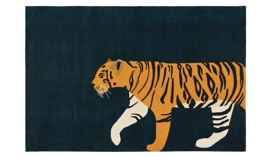
Indeed, during Milan Design Week this year, the duo was on hand at the Nanimarquina booth to launch Blend, a collection of carpets commissioned by the Spanish company. While Blend is one of Raw Color’s first forays into big-brand products, the firm has a long-standing connection to the world of furniture, textiles and carpeting, providing a handful of European manufacturers with everything from booth displays to retooled brand identities.
How the firm’s name came about was almost by chance. Brach and ter Haar met at Design Academy Eindhoven, where she focused on textiles and he studied product design. What started as a romantic relationship turned into a business partnership after they graduated in 2007. While they each tried to launch their own solo practice, Brach was working three days a week for Dutch designer Hella Jongerius when he received a last-minute invitation to take part in a local group show. With only a month to prepare, he decided to pool talents with ter Haar. That project, called Raw Color, was an exploration of vegetable dyes, presented as a meticulously ordered catalogue of colour swatches. Its tidiness belied the intense experimentation behind it, of testing natural solutions and papers in dozens of combinations. The installation was a hit, and, realizing they needed a studio name, the two designers went with the title of the piece. “So in a sense the name was chosen for us,” says Brach.
In the decade since, the pair has taken on a variety of commissions, including overhauling the brand identity of Dutch table maker Arco, and creating the tri-tone ribbon that covers the shades of the bestselling Tripode lamps (by Barcelona lighting company Santa & Cole). The common element to all of Raw Color’s work is a balance of Brach’s graphic strengths and ter Haar’s sense of composition and materiality. “I’m more on the systems side of things,” says Brach. “Daniera showed me how to trust my intuition.”
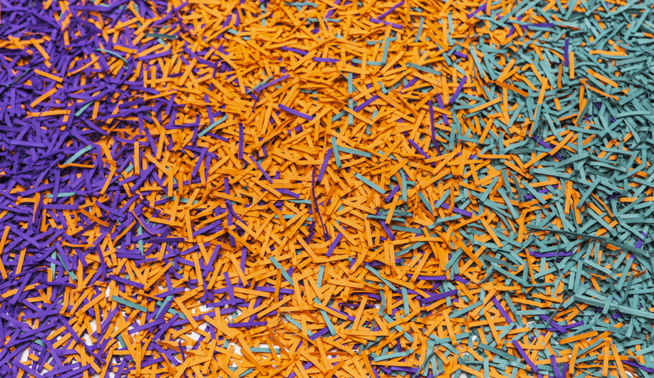
Their most distinctive work has been in response to wide-open briefs that allow product, graphic design and installation to fuse. At a gallery in Aarhus, Raw Color exhibited a wall of electric fans. When the fans were switched on, their tri-colour blades blended into a circular gradient. Another project, Chromatology – developed for a 2015 show in Eindhoven and remounted at Aram Gallery last fall during the London Design Festival – consisted of motion-activated paper shredders suspended at eye level. Fed with rolls of orange, purple and green paper, the shredders rained down bits of coloured confetti onto a blank surface as visitors walked by.
The studio is now settling into its new home in a rare pocket of undeveloped land in northwest Eindhoven – the former multi-building headquarters of technology brand Philips. At first glance, the post-industrial site looks like any other, but designer Piet Hein Eek (whose own woodworking facility occupies one of the factories) is working to transform it into a hub for Eindhoven’s outsized design community. Rows of smaller studios, a gallery and a café will all be redesigned with his creative supervision. Across a bulldozed stretch of land from this compound, Raw Color is set up in another former factory, also converted by Hein Eek. A wide, glazed incision now splits the building down the middle, dividing it into live/work units that highlight the original exposed girders and cast-concrete ceilings.
When I visited in January, the tidy studio’s worktops were scattered with swatches of fabric (an ongoing collaboration with Dutch fabric brand Ecological Textiles) and mechanical bits and pieces (prototypes for a clock project dubbed Graphic Time). “The idea for these clocks has been in our minds for three years,” Brach told me. “Why are there always arms on a clock? Why can’t it be graphical surfaces that move?” Graphic Time’s models each comprise three discs of etched lacquered steel or laser-cut paper, which make ever-changing patterns as their rotations mark off the hours, minutes and seconds.
The clocks made an appearance at New York’s Chamber Gallery in March, an experience that can only lead to more attention for Raw Color’s unique blend of graphics and objects. “We do aim to be a bit more international,” Brach says of the studio’s recent shows and collaborations. “That’s something we’re hoping for.”


